I’ve mentioned in previous updates how pleased I am with THE LITTLE DEATH, the MIKE HAMMER audio novel I wrote for producer Carl Amari, which Blackstone will be issuing momentarily (Amazon lists it as already in print, but I haven’t seen a copy yet).
As you may recall, I got to go to Chicago and watch Stacy Keach and a gifted cast (including Second City veteran Tim Kazurinsky) bring my script to audio life. This is the second volume of THE NEW ADVENTURES OF MIKE HAMMER, but I didn’t write the first (which was two short stories as opposed to one novel). I based it on material Mickey had prepared in the fifties for both a radio version and a television one; I had adapted this during Mickey’s lifetime into the short story “The Night I Died.” And about ten years ago, I had developed it as a screenplay for Mickey and his longtime partner, Jay Bernstein, for a TV or possible theatrical movie. But a film never happened.
Now it’s a reality, as an audio “movie,” and Carl and Stacy really hit the ball out of the park. Anybody with even the slightest interest in either Mickey’s work or mine will love this. Interestingly, it marks the first time Stacy has ever played Hammer in a piece directly derived from a Spillane story.
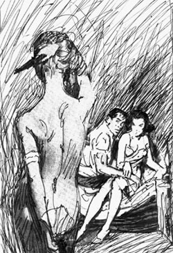
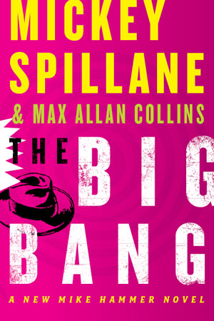
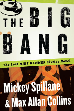
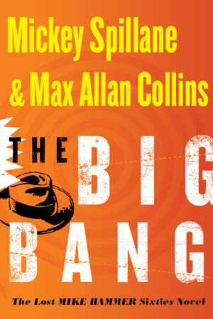
There was a nice response from my behind-the-scenes look at the creation of the cover of the forthcoming Spillane/Collins HAMMER novel, THE BIG BANG. So I thought you might enjoy seeing the several versions of the audio cover.
Here was the first try from Blackstone’s terrific art department:
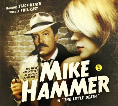
Image copyright 2009, Blackstone Audio
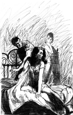
I liked this pretty well, but Stacy Keach objected to using his image so directly. He felt it made this brand-new project look like some kind of re-release of his HAMMER material from several decades ago. Carl and I agreed, and so the artist at Blackstone listened to various suggestions from all of us. I sent along attachments of the early HAMMER paperbacks, which never really showed Hammer dead-on, creating a man of mystery.
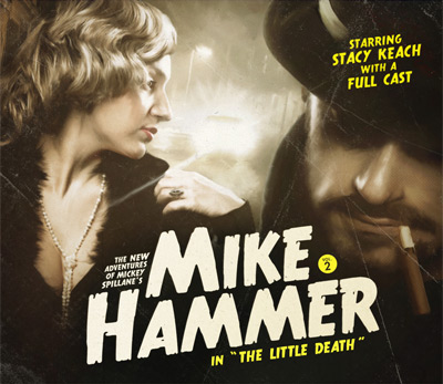
Image copyright 2009, Blackstone Audio
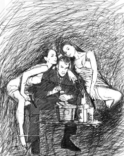
Everybody liked this better, but Stacy (and all of us) felt Hammer could use with a better-looking “babe.” Not that this model was unattractive, but Stacy wittily pointed out that she belonged on a Jane Austen cover, not Mickey Spillane. Also, a bearded, cigar-smoking Hammer was a no go—we asked that the mustache be kept (this is the Keach HAMMER, after all) and the cigar go away, Mike being strictly a Luckies kind of guy. The final version that the artist came up is terrific.
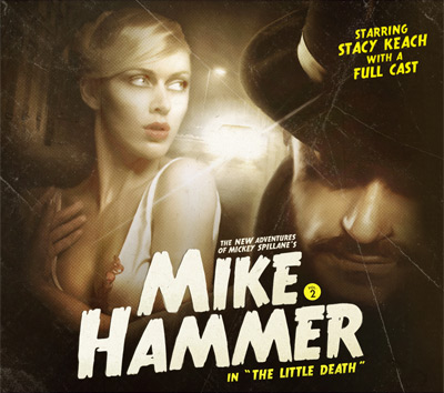
Image copyright 2009, Blackstone Audio
We had a nice turn-out at Mystery Cat Books in Cedar Rapids, despite being up against an Iowa Hawkeyes game (tough competition in this part of the world). We dined with Ed and Carol Gorman and had a great time, as Ed and I tried to top each other’s publishing horror stories.
Work continues on the graphic novel RETURN TO PERDITION, and Terry Beatty has turned in his first, finished pages—and they are knockouts. I predict this will be our best work together, at least until next time.
Quarry continues to attract fine reviews. Rod Lott at Bookgasm used his knowledge of the Quarry novels to write a particularly insightful review of THE LAST LULLABY.
And another knowledgeable Quarry fan, crime novelist Tom Piccirilli, has a Quarry-centric interview up at his blog that you may get a kick out of.
Happy Thanksgiving! For those of you in Eastern Iowa, we’ll see you at Plamor Lanes on Saturday night for our first Crusin’ gig at this venue.
M.A.C.