My Nathan Heller story, “The Blonde Tigress” (which appeared in ELLERY QUEEN MYSTERY MAGAZINE), has been nominated for a Private Eye Writers of America “Shamus” award. The awards are given at the annual PWA banquet at Bouchercon. This is the third award I’m up for at the con — THE FIRST QUARRY is up for Best Paperback “Anthony” and Best Paperback “Barry.”
Last week, my longtime research associate George Hagenauer came to Muscatine to stay for several days as we discussed and compared notes on our respective Marilyn Monroe death research for the first new Heller novel in almost ten years — BYE BYE, BABY. The book is now plotted and fulltime work on it begins very, very soon. TOR will publish either next year or early the year after.
People seem to enjoy inside stuff about the publishing process, so here’s something a little special. Over the last several weeks, the cover for the new Mike Hammer novel (to be published by Harcourt next Spring) has been developed. Oftentimes publishers just foist a cover on an author, but Harcourt allowed Jane Spillane, editor Otto Penzler and myself to weigh in.
Their first attempt was a bold one:
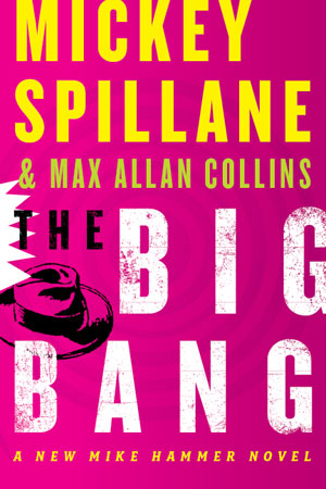
The shocking pink was calculated to really attract attention — a slap. But none of us felt pink was remotely appropriate for Hammer. Also, Otto reminded Harcourt that the contract required equal billing for me (starting with Hammer #2 — you may recall my microscopic byline on THE GOLIATH BONE). And I submitted a laundry list of suggestions, including a “reading line” as follows: “The Lost Mike Hammer Sixties Novel.” I wondered if we might have go go girls, too — something sexy and of period. Everyone agreed that the notion behind the use of pink, to suggest the wild colors of the ’60s, was a good one, just too off-the-wall for a Hammer book, pink having “chick lit” connotations.
What Harcourt’s art department came up with next responded to all of my concerns and all of my suggestions — perhaps too much….
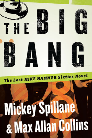
This cover seemed too busy to Jane, Otto and me — not a bad cover, but more like a trade paperback edition of a classic hardboiled novel, not a new hardcover. Most bestseller type books (and Mickey was the bestselling writer of the 20th century) put the byline on top. I liked this much better than the first cover, but Jane liked it less, who found the emphasis on white off-putting.
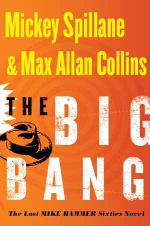
Our editor at Harcourt, Tom Bouman, was beyond patient with us. Any other editor would have thrown us out the window by now. But I wrote suggesting we revert to to first cover with a different ’60s-centric color, and that we keep my “reading line.”
What they came up with was very strong, I think. And this is the cover to look for next March:
M.A.C.
Tags: Bye Bye Baby, Covers, Nathan Heller, Spillane, The Big Bang
[…] was a nice response from my behind-the-scenes look at the creation of the cover of the forthcoming Spillane/Collins HAMMER novel, THE BIG BANG. So I […]
[…] BANG, the second Mike Hammer novel I’ve completed from an unfinished Spillane manuscript. After the battles over the cover, the package looks very strong, and I admit a thrill seeing my name sharing the cover of a Mike […]